About the new Yahoo homepage and using web analytics data to guide homepage and website redesign

Recently (October 2012), the Internet, including CNET, TechCrunch and Business Insider all had articles about the upcoming re-designed Yahoo homepage under the new CEO Marissa Mayer. The responses for the new (not launched yet) homepage were mixed; while many praised the new design for its leaner arrangement and more search-focused, others thought the changes were not significant, not worth mentioning or implementing etc. This article will give you a brief overview of the said changes, but more importantly a possible explanation for the grounds for those changes as well as the strategies that Yahoo is adopting through the new design.
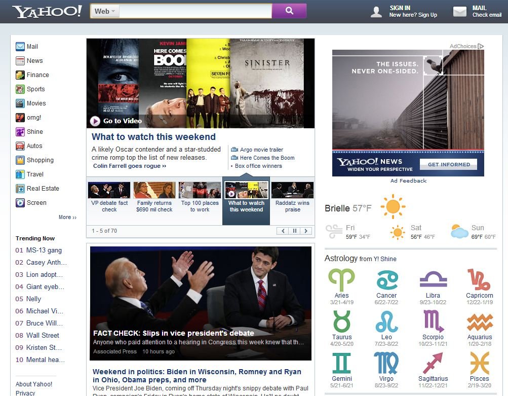
The current Yahoo homepage
Let’s take a look at the current Yahoo.com. You’ll see the search category then the search box at the top; the list of Yahoo Sites on the left; the main headlines and news at the center; the list of search trending and popular videos on the right.
The new Yahoo homepage (as reported by different online sources)
The changes
- Cosmetic changes: Yahoo! logo size and color, and the search button design
- More important changes:
- The search bar/ribbon is now at the top and stay there persistently even when you scroll down. Also, the search category is now presented in the form of a drop-down attached to the search bar. Sign in and Mail are now on the right of the search ribbon
- Yahoo main sites list is still on the left (without the header Yahoo Sites) ; however, the list gets shorter and right below it is the list of search trending
- The top right is now for banner ad and followed by Weather and Astrology
- Mostly unchanged: The center, which is still for main headlines and news
What we can say about the changes
To be exact, the new version of Yahoo homepage is the re-structured (not the re-designed) version of its current homepage. Through the brief side-by-side comparison above, we can say that the changes are not significant in terms of the look and feel — design-wise, and that’s pretty much all we can say. We can’t say intelligently whether the changes are worthwhile, or the new design will enhance the performance of the homepage — only time will tell, and only through (future) web analytics data we will know the answer.
Behind the changes – from an outsider’s perspective
Here’s my take from an outsider’s perspective about the restructured and new Yahoo homepage design. This part is what this article is about; the above you can find all over the Internet.
- Better use of the page real estate with the top ribbon: Yahoo homepage has been among the top 5 most visited pages in the world (together with Google, Facebook, YouTube and Wikipedia). Every inch on that page counts, and from the advertising perspective, every inch on that page is money. Combining and condensing the search category, search box, search button, Sign In and Mail into one ribbon persistently displayed at the top to make room for advertisement and other valuable items is a wise move.
- Better use of the page real estate with displaying only the most valuable links/assets: If you look at the current (old) Yahoo homepage, you’ll see there are 22 links under Yahoo Sites on the left. Yes, 22 of them. So what’s the point? What is the company trying to offer? What are the main sites? Apparently, 22 is a loose list of main sites. The new version displays only 12 links, which helps make room for the search trending (Trending Now).
You are probably familiar with the Pareto principle known as the 80–20 rule. This rule is widely used in business (80% of your sales come from 20% of your clients) to help you allocate your limited resources and prioritize your goals and objectives. The 80-20 rule is also useful in User Interface (UI) design where you identify the 20% of pages on your website that generate 80% of web traffic or 80% of our revenue, and spend more effort to make these pages better; instead of spending time and effort to improve each and every page of your website. Take Yahoo as an example, if you go to the homepage and click on the More Y! Sites link located at the bottom of Yahoo Sites list, you’ll see the company has around 70 sites. While it’s tempting to display more links, it’s not encouraged to do so — displaying less can actually do more for the site: giving the site a sense of focus, making it easier to navigate, easier to recognize the main (sub)sites, and creating more space to promote other content. It’s likely that the 12 sites listed (nearly 20% of the total number of sites) on the left (Mail, News, Finance, Sports, Movies…) are the ones that have received most traffic or brought the most revenues (80%). - Taking back lost market share: Yahoo’s search engine market share has been slipping significantly. The latest report from Comscore showed that as of August 2012, in the US alone, the company holds nearly 13% of search market share and ranks third after Google (66%) and Bing (16%). That number is of course much lower when going global. With the persistent, always visible search ribbon, Yahoo makes it easier for its users to search, regardless of where they are on the page/site and what information they want to find out more about. This may be the way to help it gradually get back what it lost.
- More emphasis on advertisement: With the ad section being moved to the top right (from the middle right) in the place of the previous Trending Now, the company appears to give more highlight to its ad area. This action may make the ad spot on Yahoo homepage becomes more desirable for advertisers, thus more expensive, and more ad revenue.
Your homepage redesign – What you should remember
Through this post, what I want to emphasize is if you are in the process of having your website redesign, try not to do it blindly – which is to do it the way you think is right for the site without having any data to back it up. It’s likely what you think is not the same as what your web users think or want out of your website. Try to base your decision on web analytics data if possible. Also, try to remember the the 80-20 rule and apply it along the way; less is sometimes more.
Hope it’s useful.
Let me know what you think!


This blog is very useful information for me and guidance.
This new homepage is more frustrating the ancient AOL.
Hi my friend! I want to say that this post is amazing, nice written and include approximately all important infos. I’d like to see more posts like this.
Gleenie, I can assume that you work for Yahoo and your “comments” were deliberately planted here.
Hello Bob. I’m not working for Yahoo. I just liked the personal perspective the author posted here, instead of the mere mindless account of the news, found on other sites.