What to Do When Your Website Traffic Dropped

Use fish-bone technique to diagnose causes of your site traffic changes
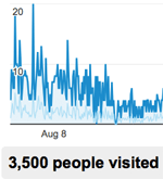
When Website Traffic Dropped

With the introduction of Google Panda and Penguin (mentioned in Google Updates and Your Search Ranking) many sites experienced significant drop in search ranking and web traffic. If your site is among those sites, and you’re aware of Google and other search engine algorithm changes, you can easily jump to the conclusion that the drop in traffic is due to search algorithm updates. While your judgement might be correct, it’s not sufficient. This post will give you an overview of how to uncover the issue, or more exactly the cause(s) of the issue by using the fish-bone diagram.

In case you’re not familiar with fish-bone diagram, this diagram, also known as the cause-and-effect or Ishikawa diagram, is basically a technique (diagram) where you visually list all major potential factors causing the issue (in this case the drop in your website traffic in Q4 2012) in an organized and systematic way. The diagram looks like a fish bone where you write down the effect/problem in the head of the fish, and each contributing cause will be represented by a bone. Depending on how complex the issue and the system is, you may have several main bones (main causes) from where smaller bones (smaller causes) branching out.

Draw your initial fish-bone diagram

Web traffic can come from different sources below. Thus, a drop in any of these sources, not just search engine algorithm changes, can easily affect the amount of traffic to your site.

  • Traffic from search engines (organic and paid search)
  • Direct traffic
  • Referrals

You can start your Fish-bone diagram with the fundamental elements above as the main categories. From there, you can brainstorm other contributing factors.
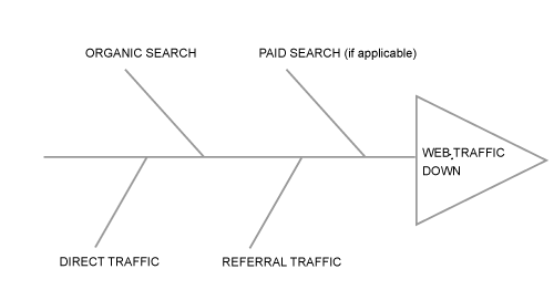
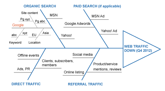
Fish-bone diagram

Fill up your diagram

Brainstorming as many contributing factors applicable to your business as possible. Below are some suggestions to get you started.

  • Search engine traffic can come from organic search (Google, Yahoo!, MSN and other search engines) and paid search, if you’ve used any. You can even go much deeper with each search engine. For example, if people come to your site through Google with certain keywords abc or xyz, you can list those keywords as branches under Google in your diagram, and do the same thing with other search engines. In a similar fashion, instead of or together with using keywords, you can use location and list the locations (continents, countries, cities) that your site receive most visitors with Google, Yahoo! or MSN search. Besides keyword and location, site content (page abc, or page xyz) can also be used as a good contributing factor under each search engine.
  • Direct traffic can be visits from your website members, subscribers and clients. Those are the ones who have already known and bookmarked your site URL. Direct traffic can also come from new visitors who know your website URL through your TV commercials, magazine ads, postcard ads, your direct marketing campaign emails, or through your company offline events and PR activities including sponsorship, conference, seminar, trade show, product demonstration, etc.
  • Referral traffic are from visitors who come (or are referred) to your site by clicking on link(s) placed on other websites. Thus, traffic from social media sites like Facebook, LinkedIn, Twitter, YouTube or from other sites where your products/services are listed (Amazon.com, eBay) or mentioned/reviewed (The Wall Street Journal, CNET, websites/blogs run by individual users) are referral traffic.

Fish-bone diagram

Make sub-diagram if necessary

As you can tell from the above figure, the diagram can get very crowded very quickly. To make it easier to follow, you can draw a sub-diagram for any complex item such as Organic Search > Google in this example and investigate the elements on the sub-diagram separately.

Compare the data

Since the goal is to find out why traffic to your site (in Q4 2012) decreases (compared to previous quarter or the same quarter last year), the next step is to find out what areas (items on your diagram) experience significant drop in traffic. By comparing the data (between Q4 2012 and the previous quarter or previous year), you can pinpoint exactly what went wrong and from there you can find out why as well as how to fix and who (what team) can fix it.

Some last note: although in this post I’ve only mentioned the case of web traffic drop, you can use the Fish-bone diagram in almost every situation to help you uncover the causes of your business problem(s). The steps and technique should be the same. Hope it’s helpful, and all the best!


Related Posts:


3 Responses to What to Do When Your Website Traffic Dropped

  1. I’ve only used the Fish-bone diagram once in the past to solve other problem. I think the suggestion to make sub-diagram as above is very good. You can also cross out/erase elements that you’ve already checked and confirmed are not the ones causing the effect. This way your final diagram only contains elements that cause the effect; thus easier to navigate through each of them for further analysis.

  2. While the idea of using fish-bone diagram is interesting as it reminds us to write down the problem and possible causes before being able to solve it, your post didn’t touch the “why” in a more meaningful way. But it’s still a good piece.

Leave a Reply

Your email address will not be published. Required fields are marked *